The newly adapted logo to match the colors and graphics of the project
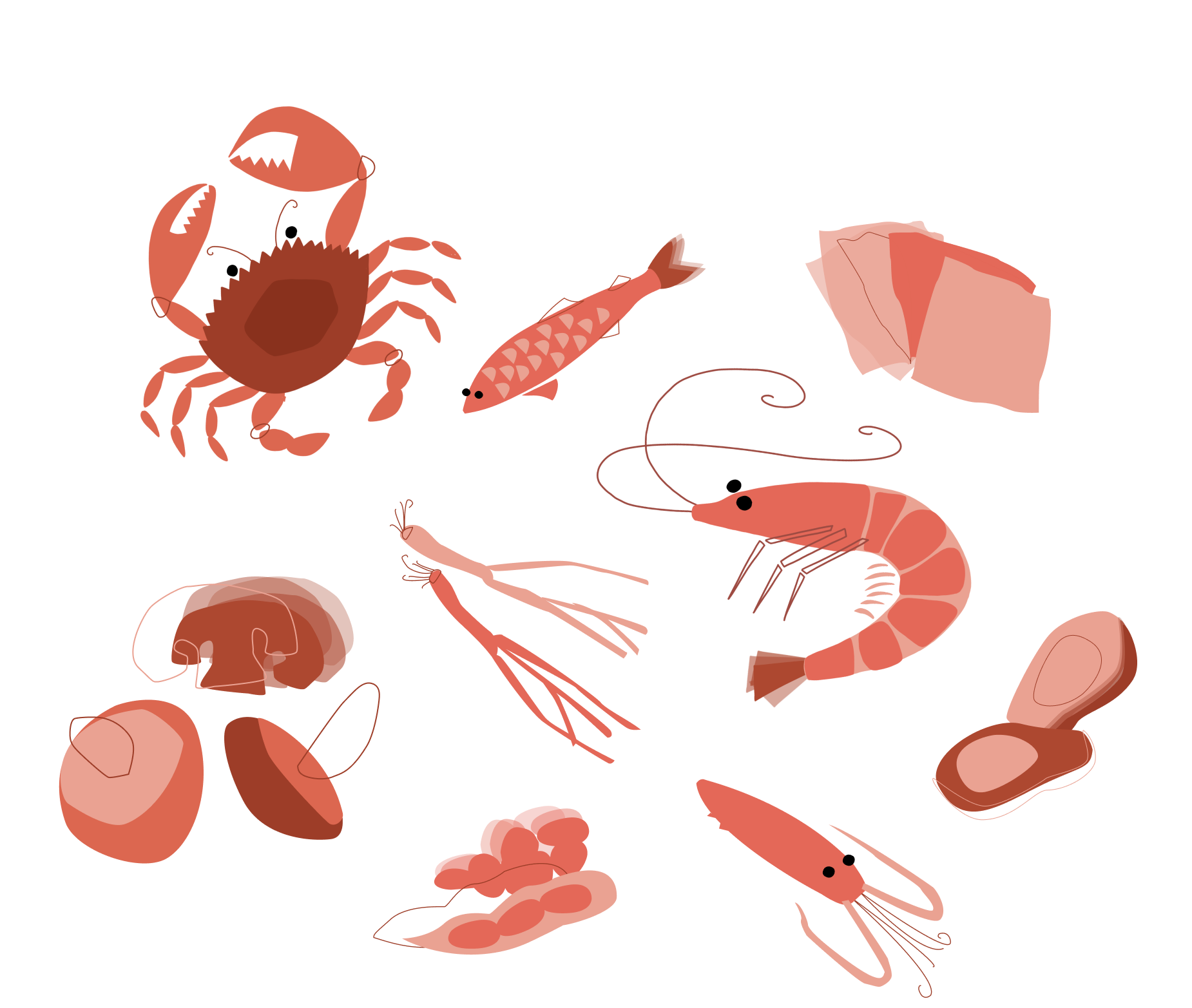
The Japanese kitchen is rich in incredible ingredients which citizens of the West may not be completely familiar with.
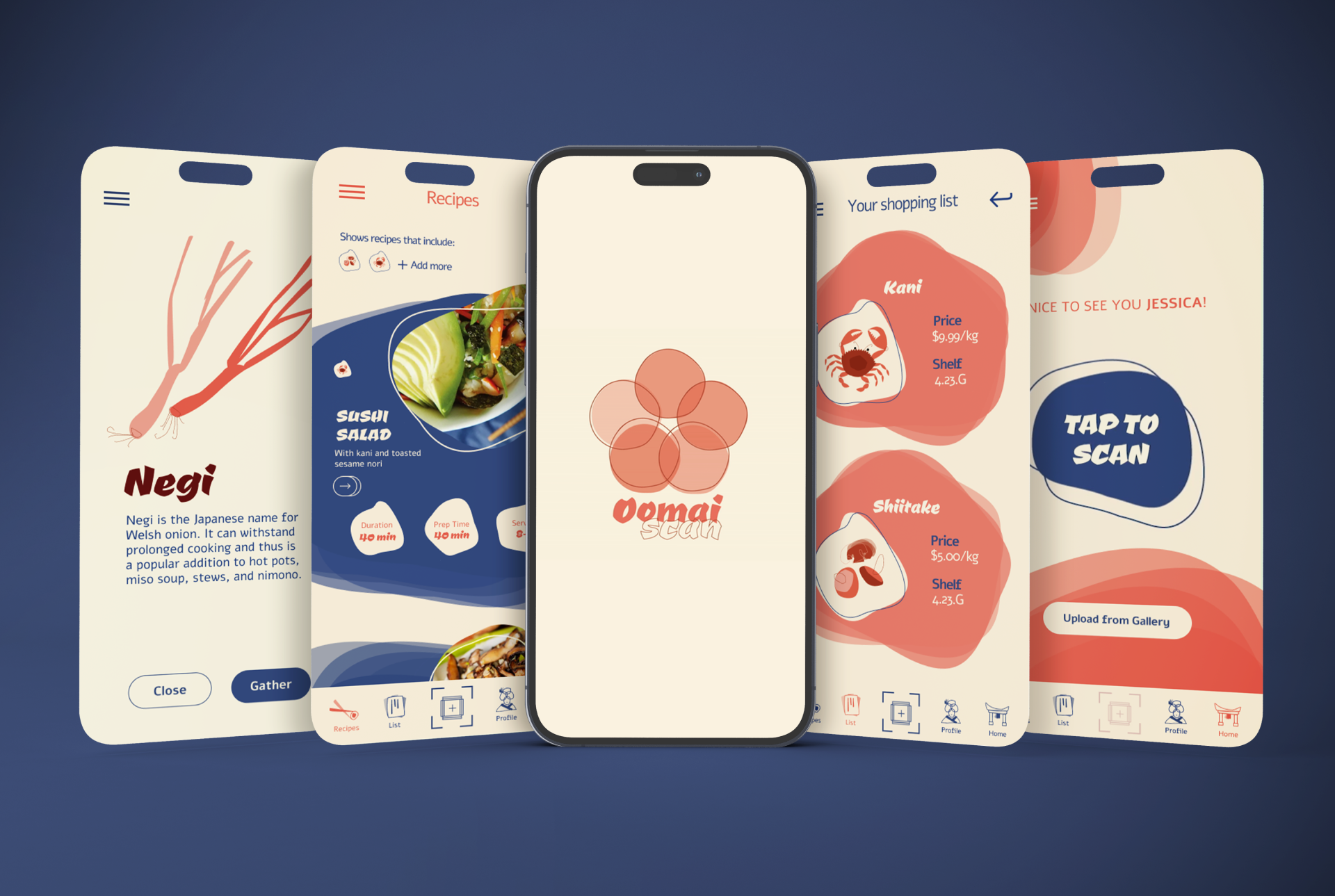
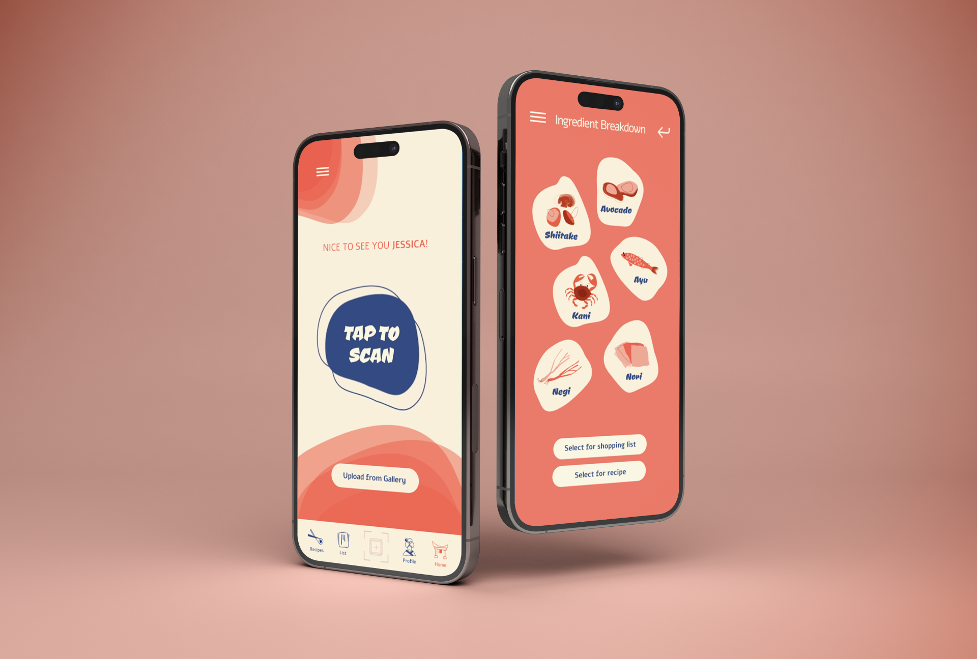
Oomai Deli is a self-serve restaurant/grocery store from the Japanese kitchen. In any regular Japanese restaurant there is a server who continuously comes to the table and is able to provide knowledgable information in regards to the different dishes on offer. Since Oomai is self-serve there are no servers to constantly answer our questions in regards to the different ingredients comprising each meal or item we are interested in.
This app offers a solution to said problem;
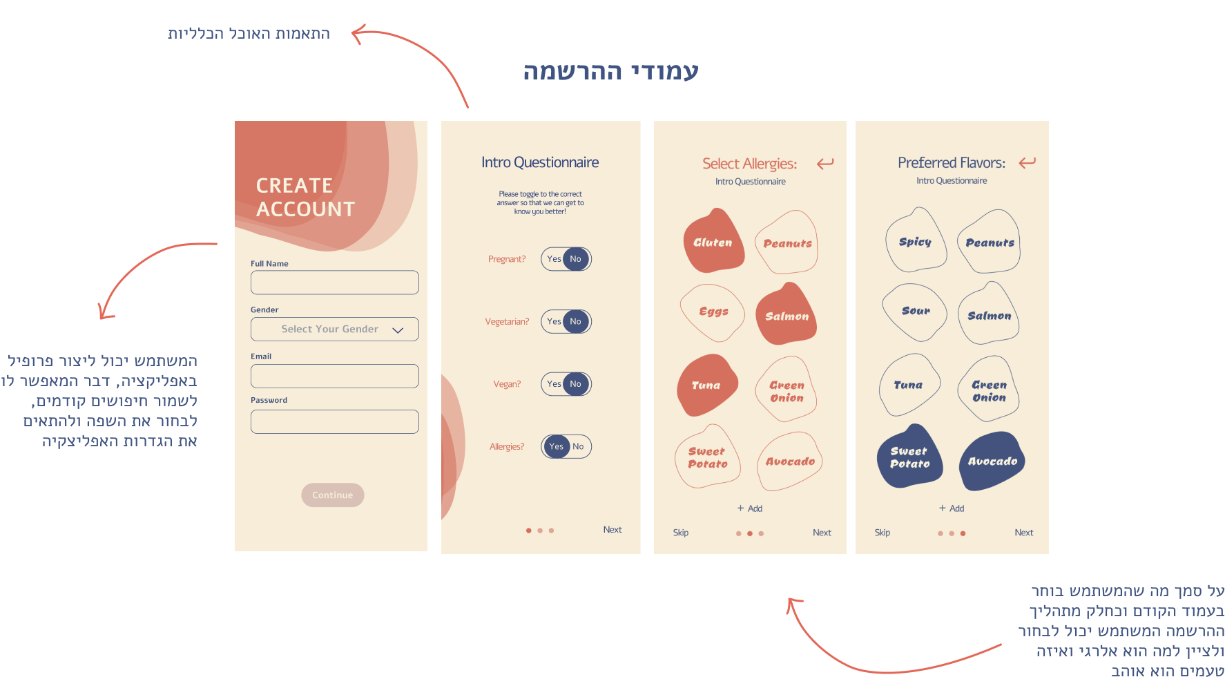
It allows the customer to:
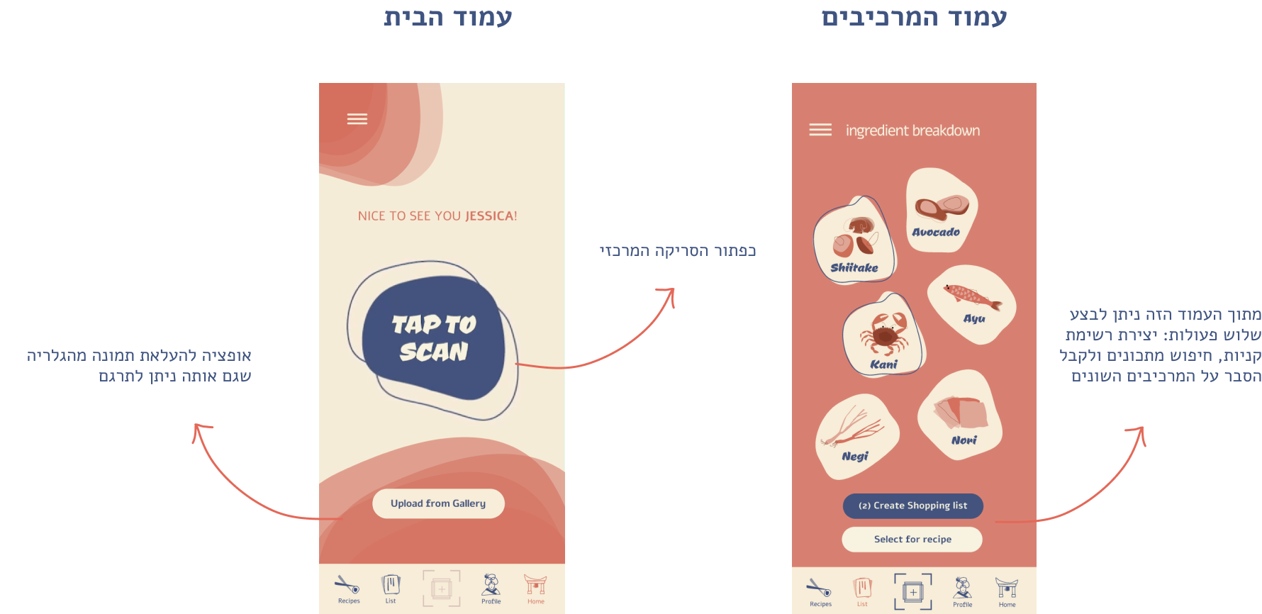
- Scan unfamiliar words and get an immediate translation
- Scan pre-prepared meals and get a breakdown of the ingredients
- List any allergies they may have which allows the scan to warn them of potential dangers
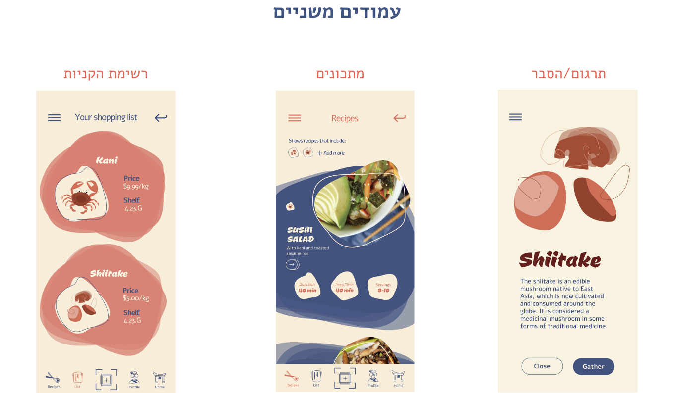
- Curate a shopping list specific to Oomai stores
- Curate a list of recipes based on favored ingredients
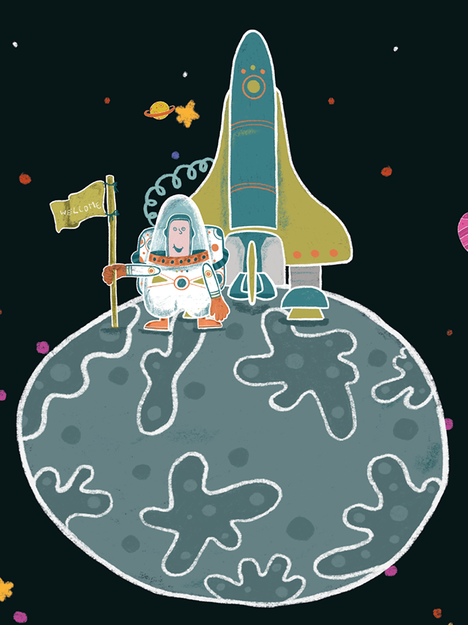
The illustrations
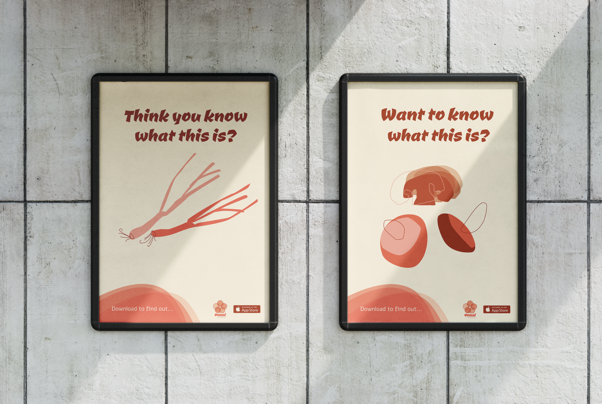
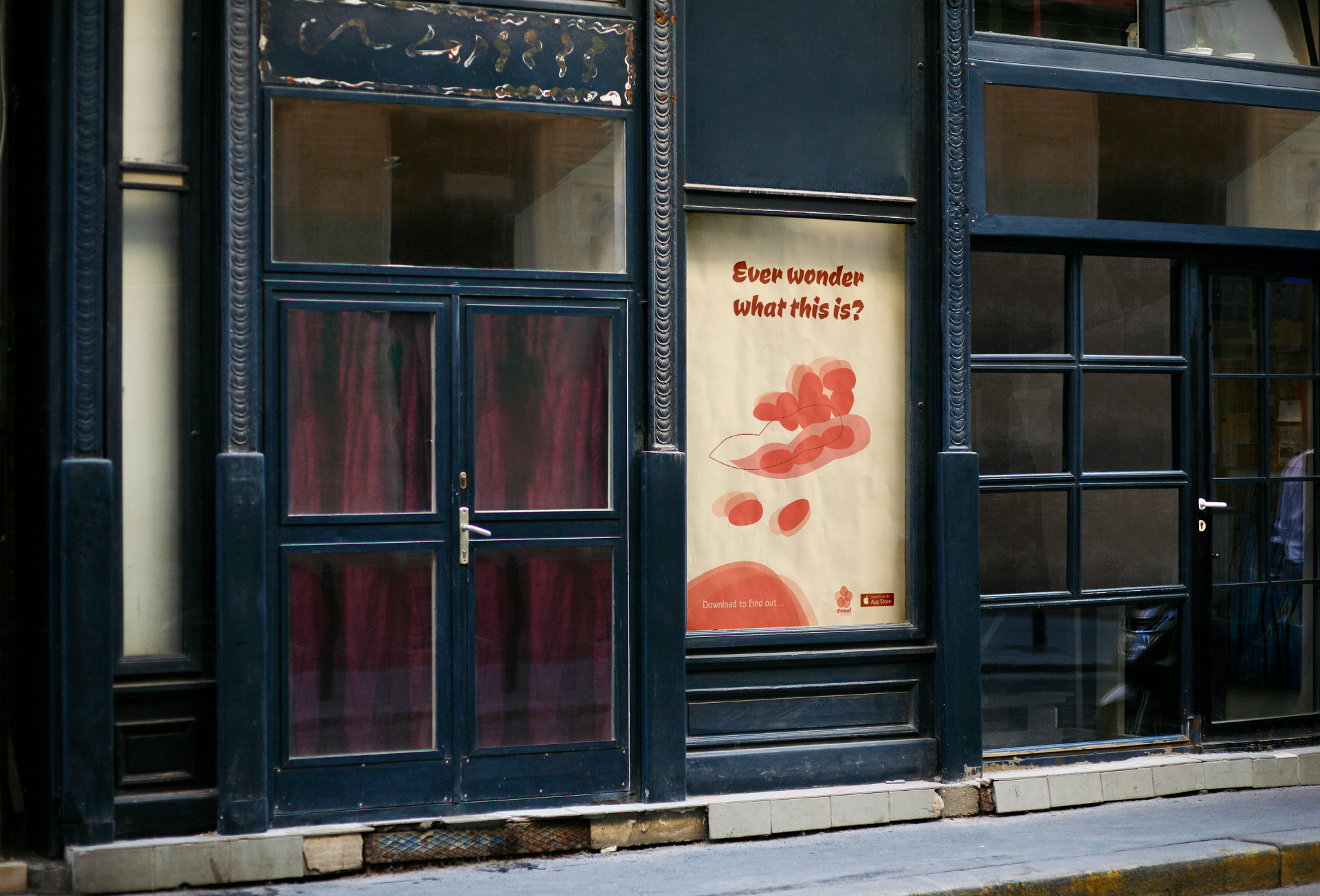
The App was heavily based on illustrations. I wanted the experience of "translating" to feel more complete. When seeing these illustrations you get a visual understanding of what you are scanning.
The style of illustration was inspired by Japanese art which uses layers and a combination of line and solid colors.
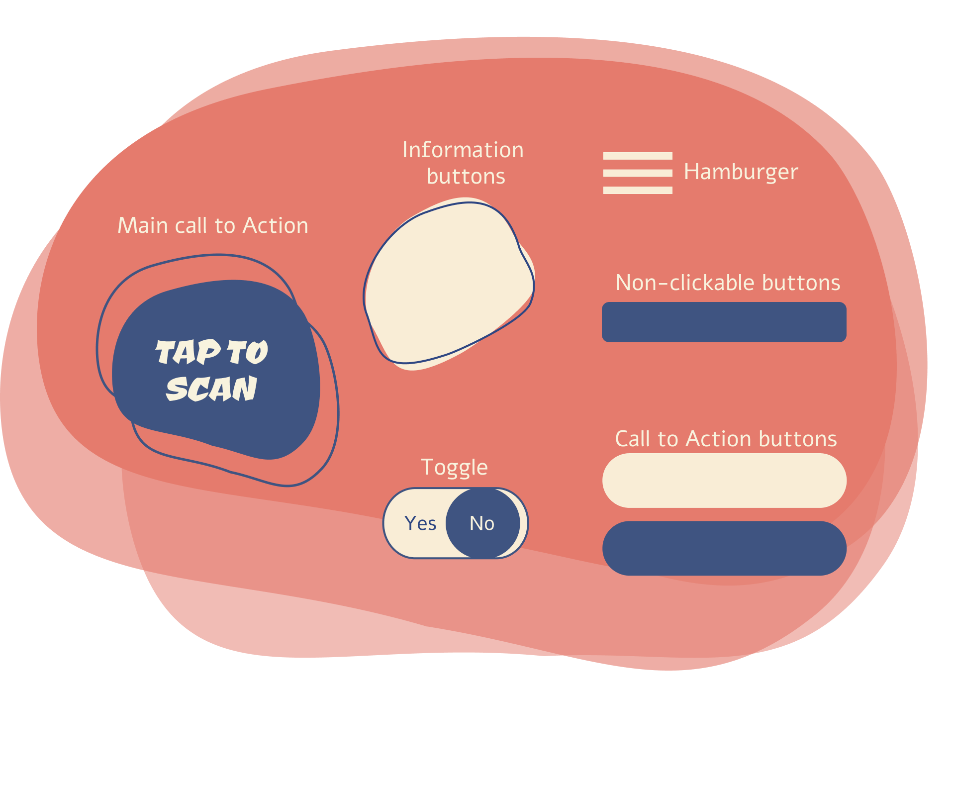
The buttons
The shapes of the buttons we click on in order to get information are amorphic and irregular. I wanted these specific buttons to speak the same "language" as the illustrations as they are usually placed together.
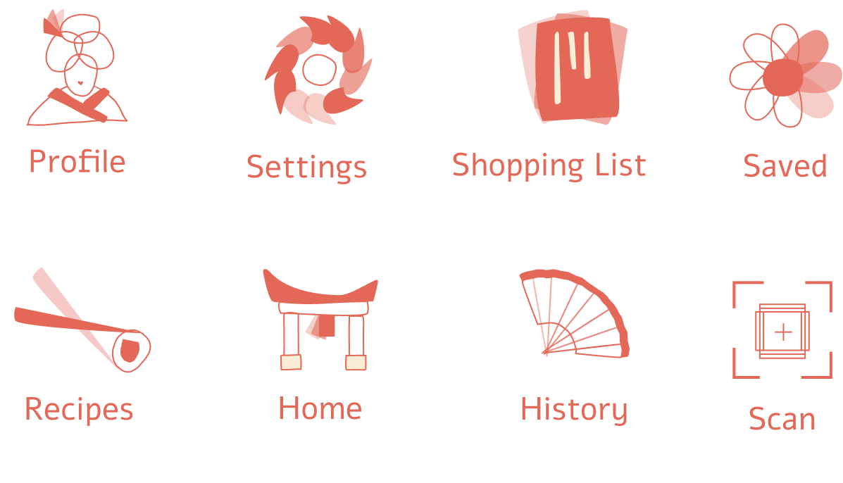
The icons
I wanted, again, the icons to speak the same "language" as the illustrations as they have led quite a distinct graphic style for the app. The icons are simpler and less detailed to make sure they are legible when small, and also use the combination of layers, line and solid colors. These icons are mainly used in the nav-bar.
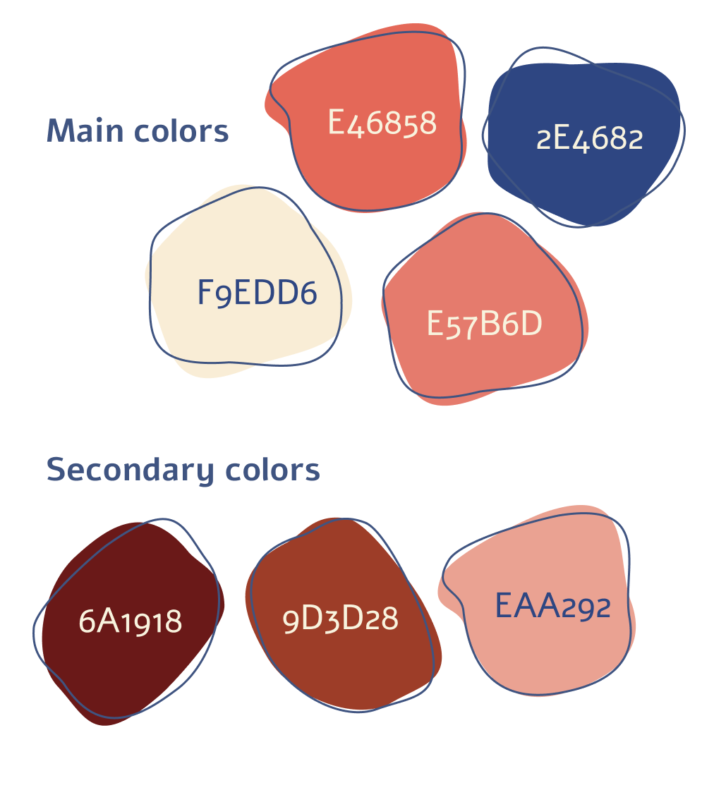
The color palette
The colors were inspired by Japanese art and posters. A combination of muted salmon and blue tones.
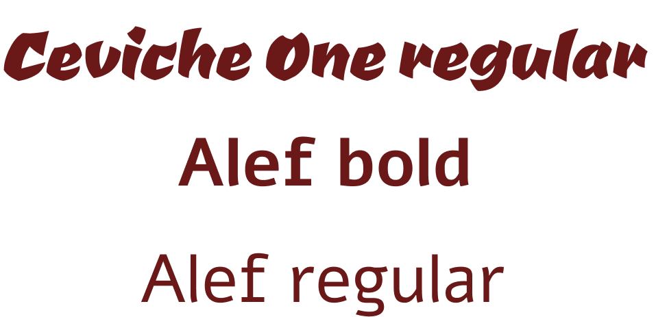
The fonts
I used a combination of two fonts; one that is more Japanese-esque, and feels more traditional. This font was used mainly in headings.
The other font, used in two weights, was used in text-heavy places as it is easy to read.
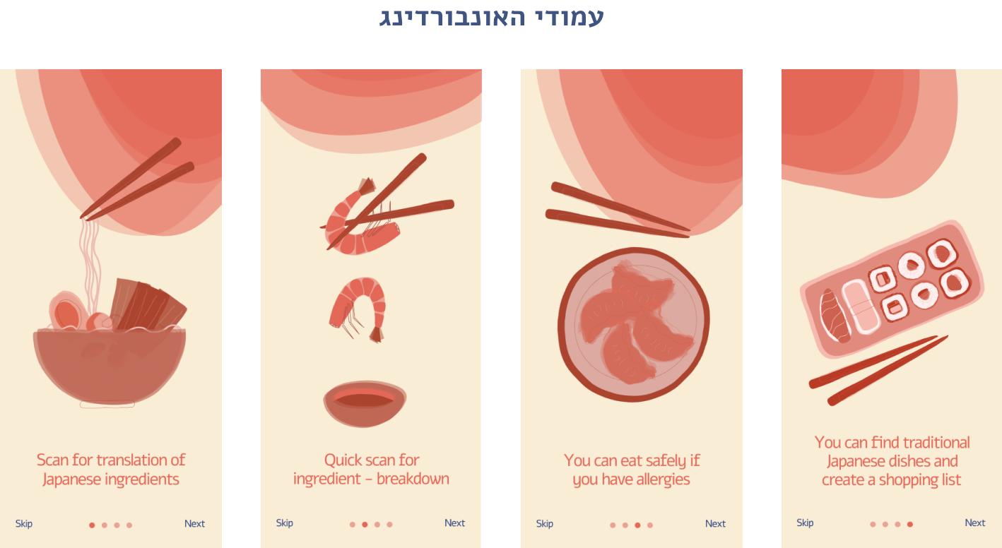
The app
These are the main screens from the app which explain the purpose and flow.
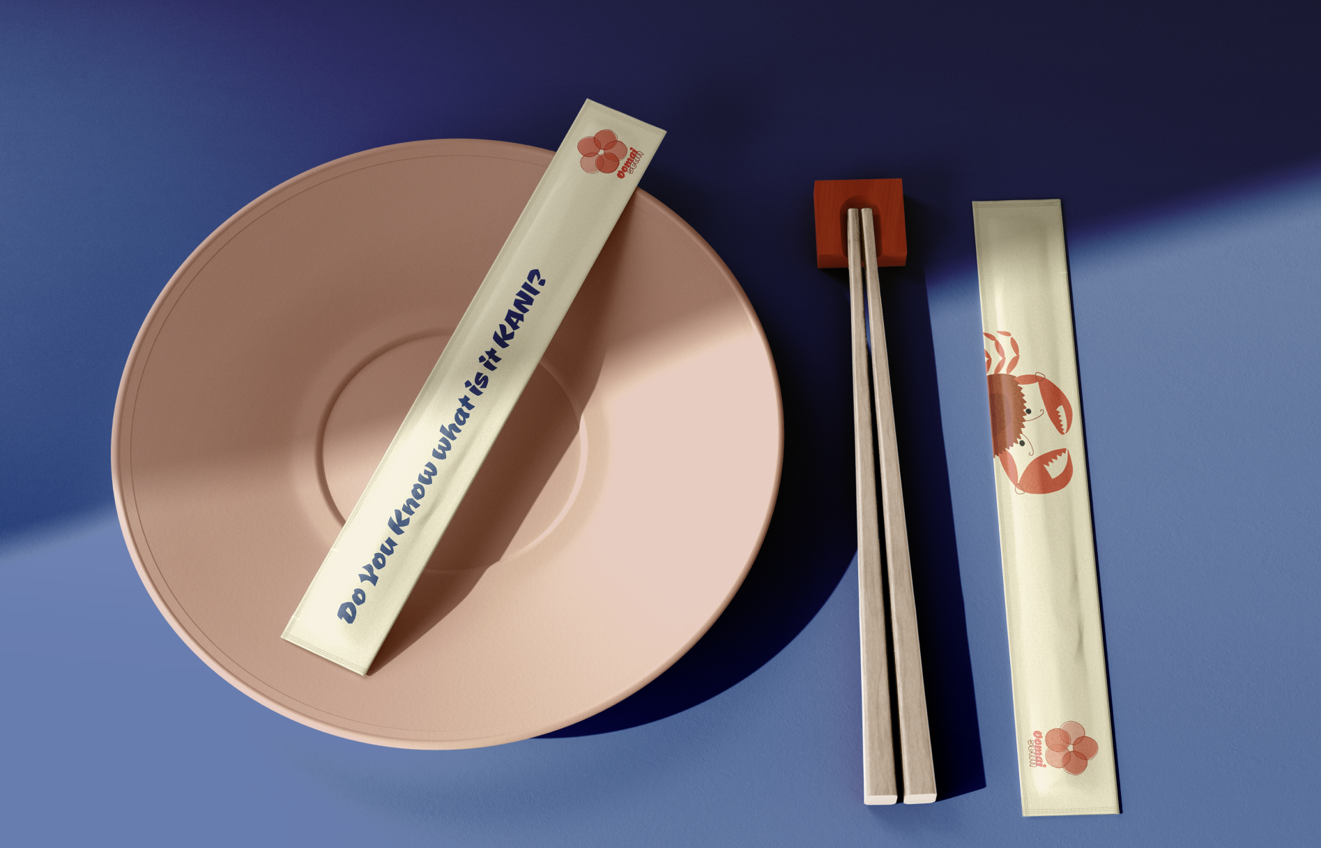
Merchandise
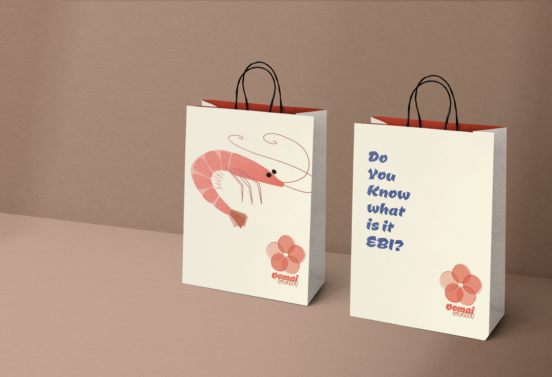
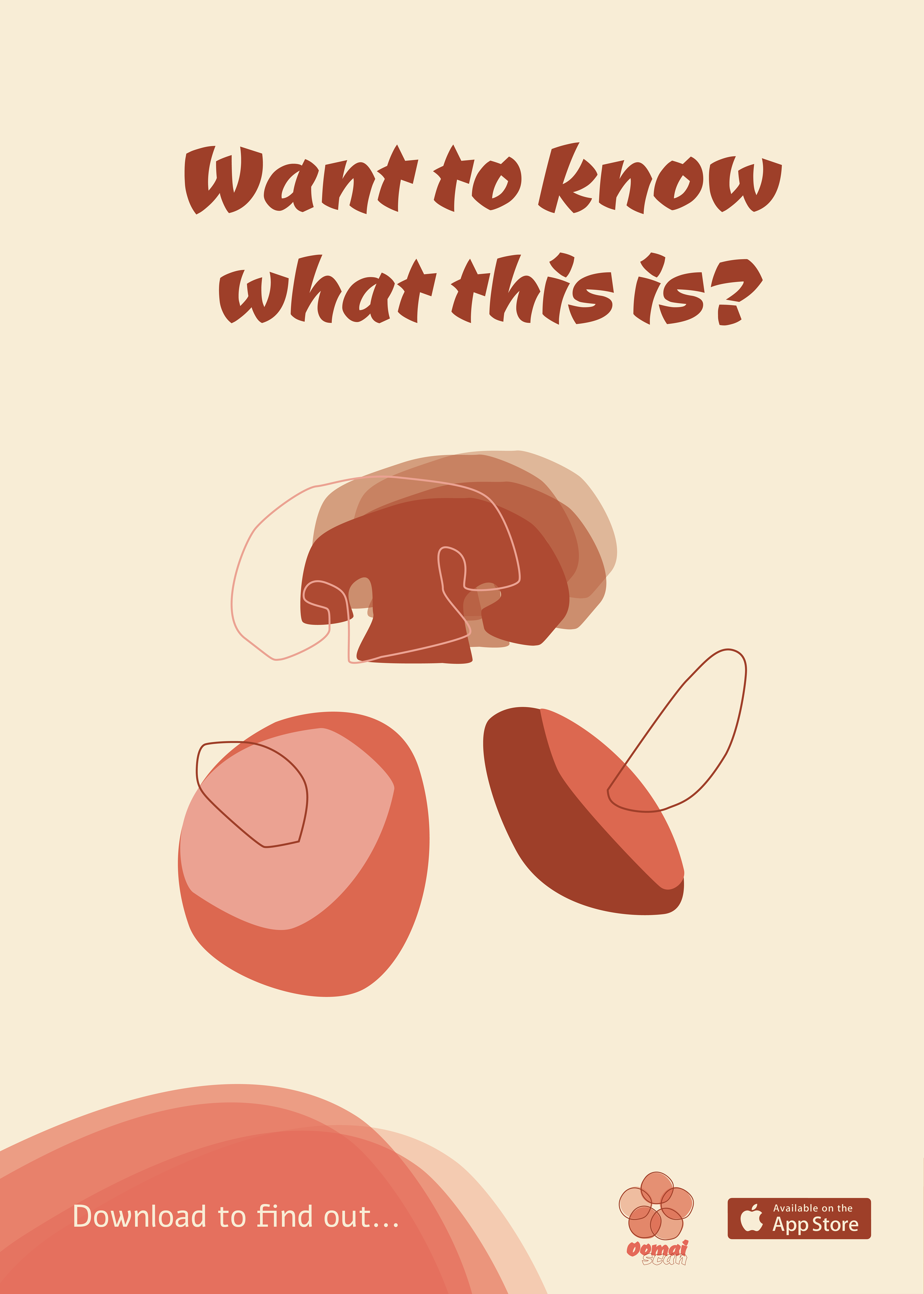
Posters to promote the app
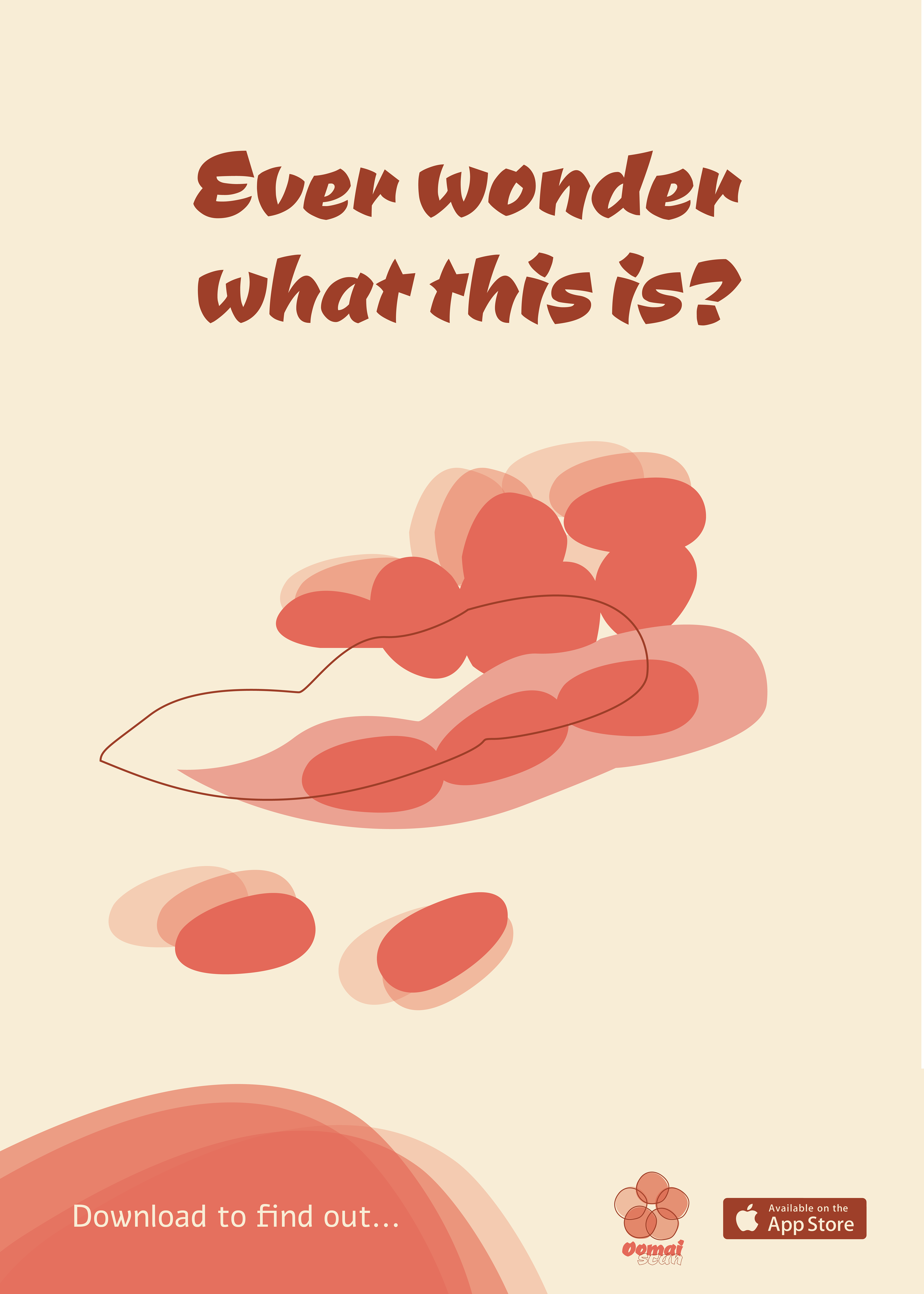
Using illustrations from the app
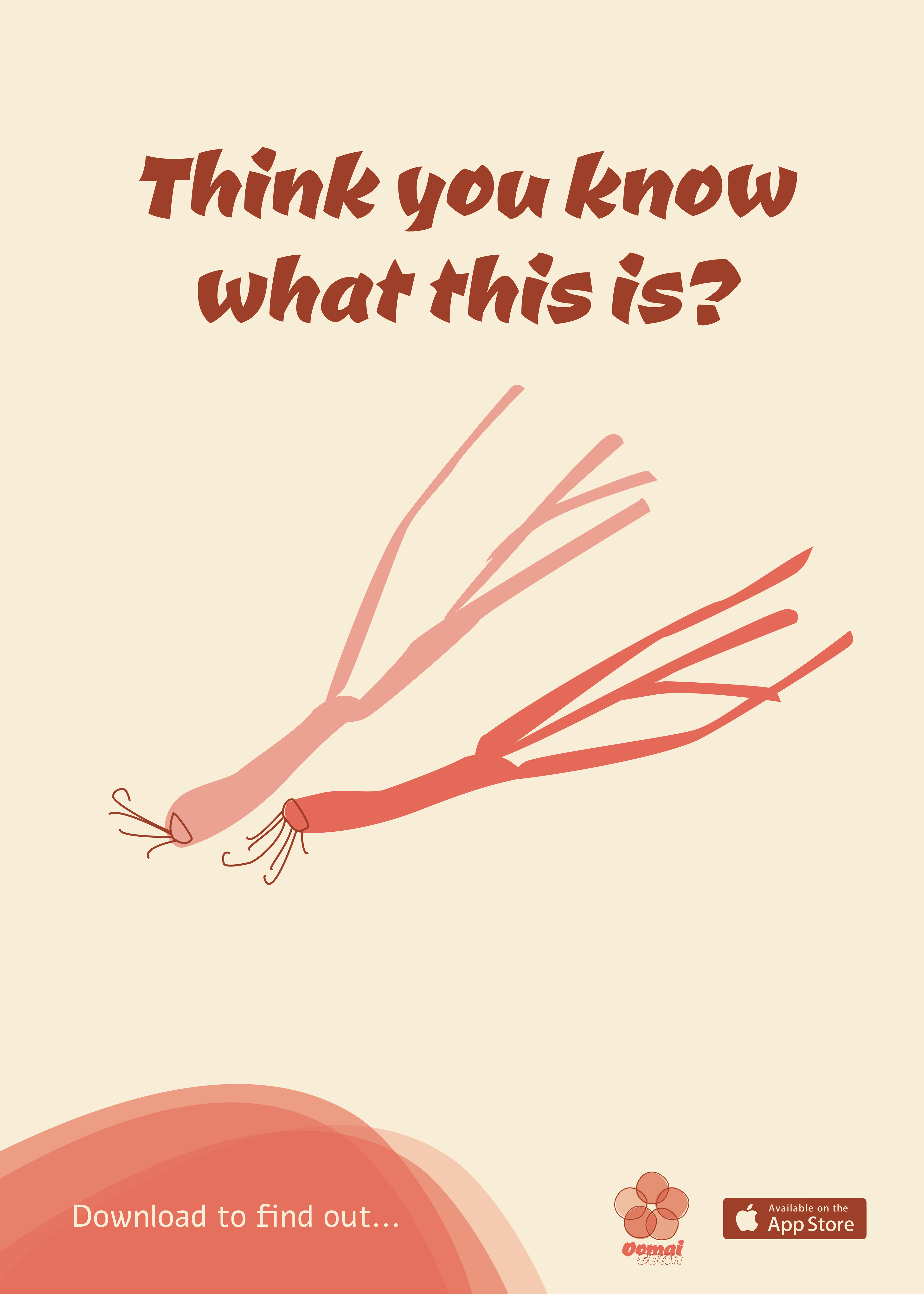
Using the same color palette and fonts