When Maya and Jonathan approached me and told me about their Greek wedding I couldn't wait to give them the branding they deserved. We wanted to create something young, fun and colorful that may not be the typical "greek aesthetic" we all know and love. We wanted something different that would fit with the personality and style of the couple.
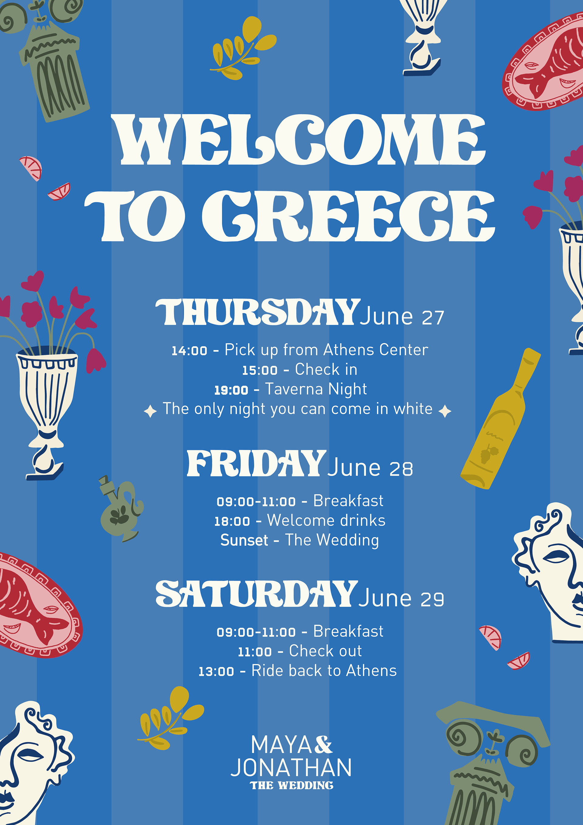
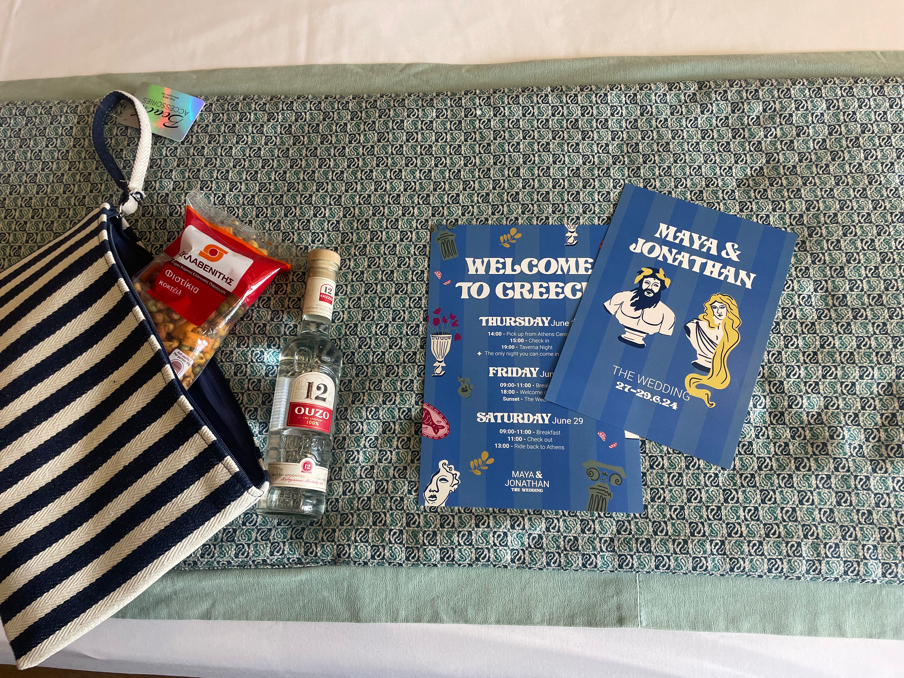
So we started off with the schedule for the three day event. We combined elements typically associated with Greece, as well as the blue and white colors which we couldn't ignore but we also added splashes of pink, yellow and green to give it the freshness and summery feel we wanted.
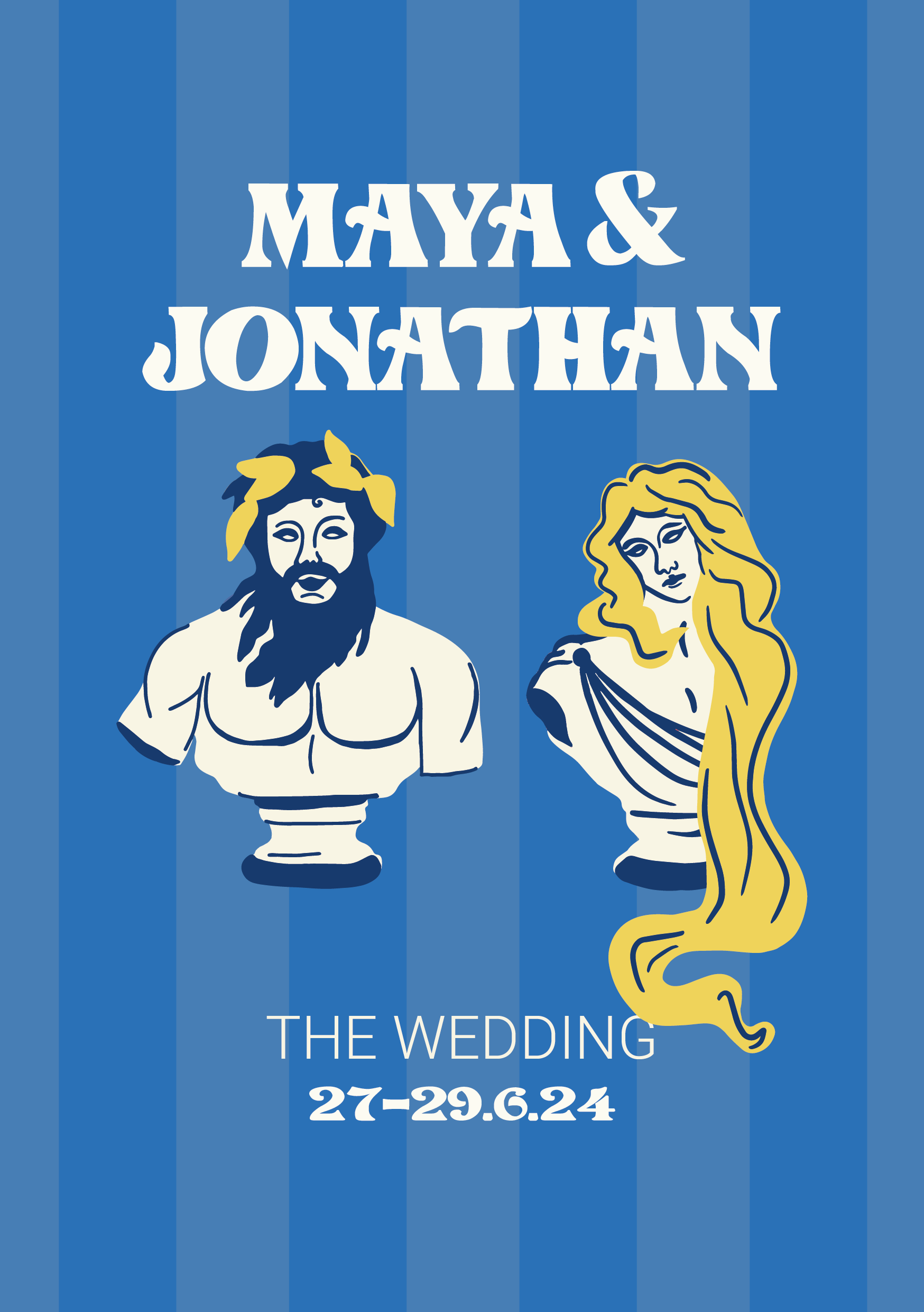
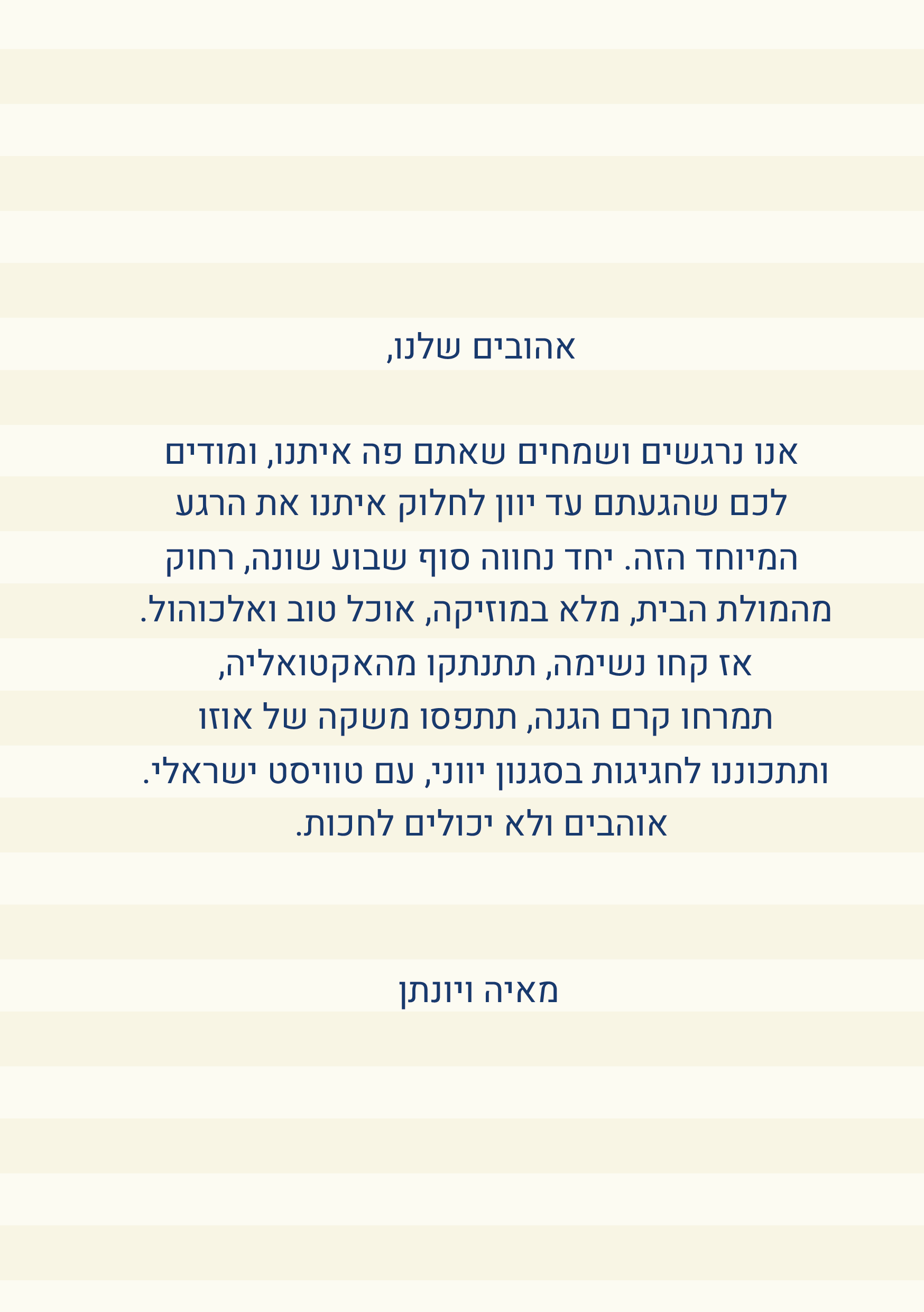
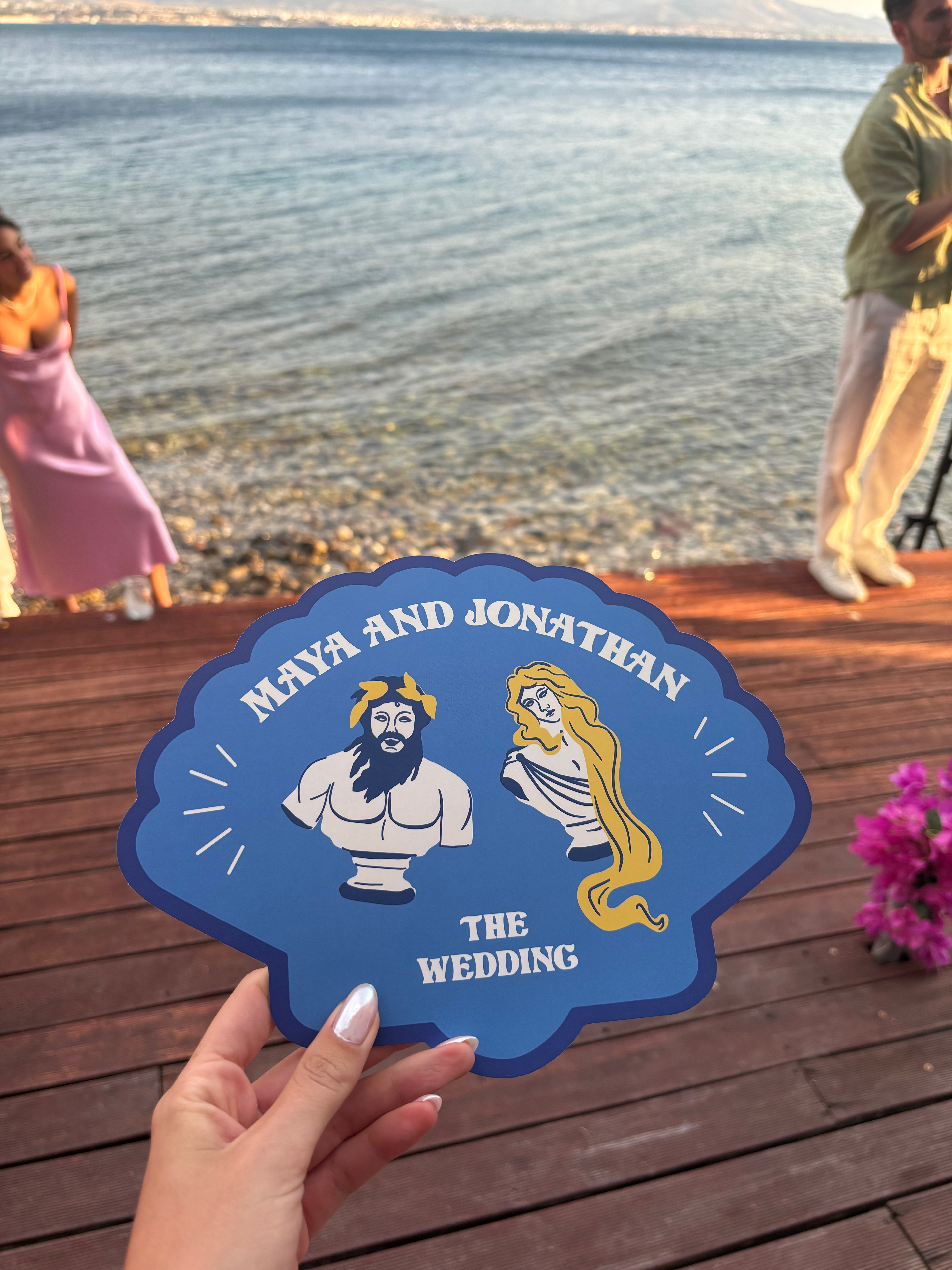
Next up was a greeting card from the couple. The front side had my interpretation of the couple as Greek Gods, believe me, they actually look like that. The back of the card had a personal message the couple wrote, thanking the guests for coming.
the front
the back
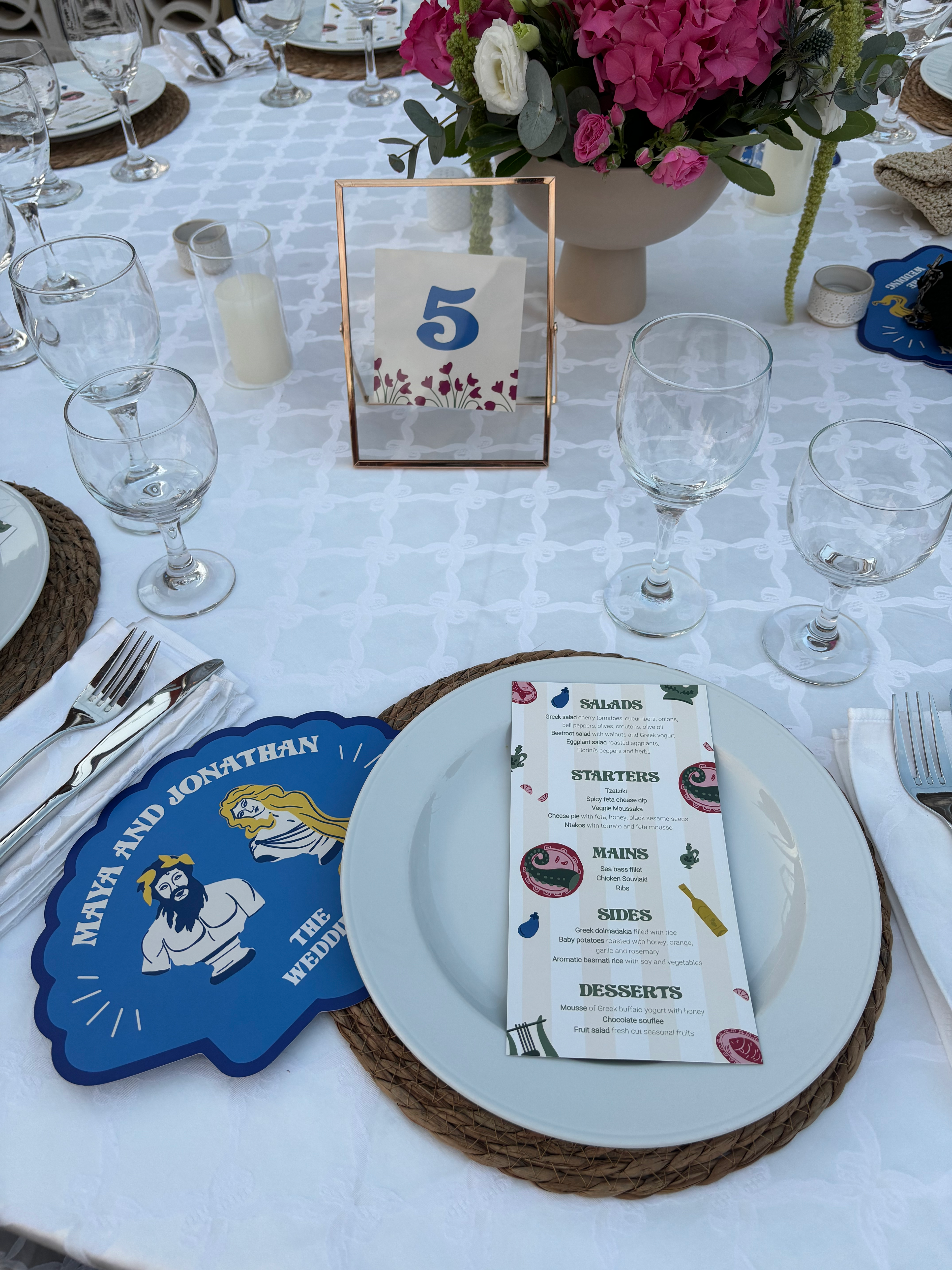
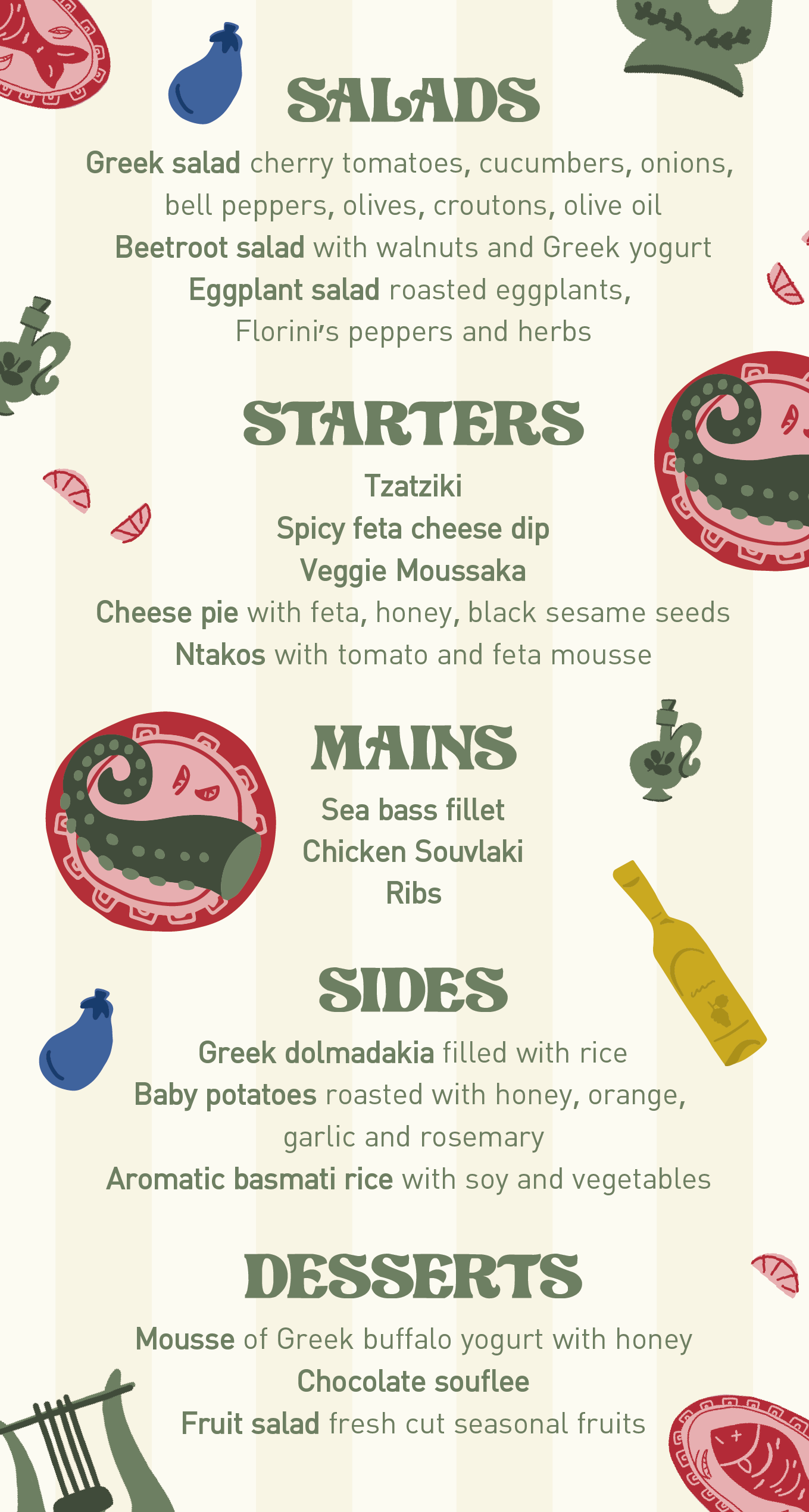
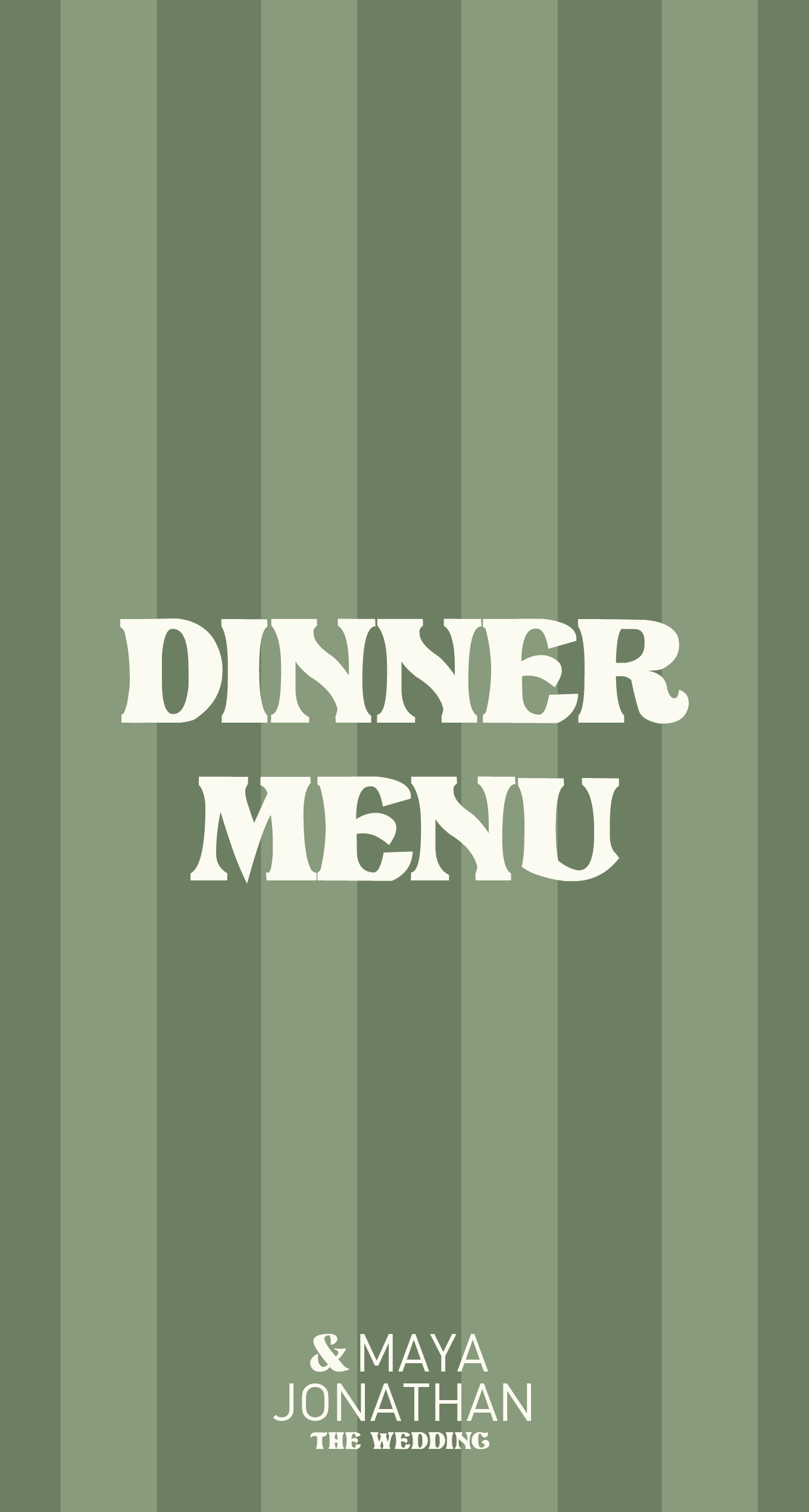
The following task was creating the dinner menus. I wanted to keep the same line as we did with the schedule but played around with the colors to create some variation. The menu got its own fun illustrations to get people excited for the dinner they are about to have. It was also important for me to have a correlating design on the back of the menus, so even when looked at from behind they will be beautiful.

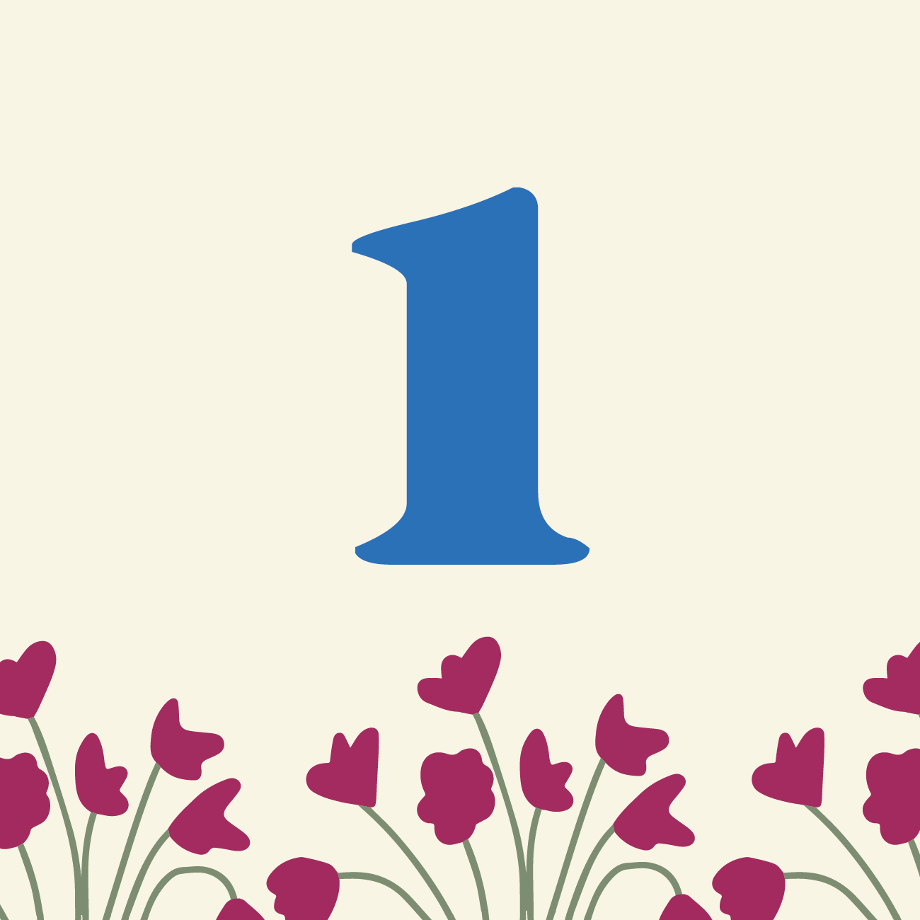
Of course, we couldn't forget the table numbers. The table numbers were inspired by the floral arrangements that were placed of the table.

Last but certainly not least were the fans. We knew fans were a must given how hot it is in Greece, but we didn't want to do plain fans. We wanted it to be in coherence with the rest of the branding and give it that personal touch we love so much.

Using the graphics of the couple as Greek gods was humorous and the blue color popped against the backdrop. They were the hit of the evening!